Showing posts with label PCXML. Show all posts

Saturday, April 25, 2009

OBIEE Opaque data labels on charts

Recently I was asked how to get opaque (see trough) data labels on a chart:

image

This is control by the pcxml file belonging to the Graph type:

Open the file in an editor and look for the "DataLabels" tag. Edit the last to numbers (hex) of the BGColor subtag to "00"

image

(sync the file with the one in the OC4J if used). Restart everything.

Till Next Time

Tuesday, October 7, 2008

OBIEE Show Thousands Separator in Chart

A customer wantend no thousand seperator by default for the y-axis in there graphs:
This is very easy when add: ShowThousandsSeparator='False' in the ValueScale tag in the PCXML file of the graph

Till Next Time

Wednesday, September 17, 2008

OBIEE Setting a picture as graph backgound

One of our customers wanted a custom background for there graphs, some what in this style :-) :

So that the would end up with a graph looking like this:Step 1: from the corda archives download version 5.1.2:http://www.corda.com/corda-update-archive.php There is a fourteen day free license key, after that you will have to buy the product.

Step 2: With the popchart builder create a new graph using the wizard, any graph will do.

Press the add image button:In the PCXML file locate the {ChartBitmap part:

Copy and paste into the PCXML file of your OBIEE graph. between the {project} tags.

Add the following reference to make the graph visible:

Playaround with zindex, if the image isn't fully on the background.

Till Next Time

Friday, September 12, 2008

OBIEE setting default Graph series colors.

If you want to set the default color for your graph, goto …\OracleBI\web\app\res\s_{StyleName}\chartsupport
Open the palette.cxml file and edit the sawc:color value=. The color is represented by a web Hex color.
Save the file.
Copy the file to …\OracleBI\oc4j_bi\j2ee\home\applications\analytics\analytics\res\s_{StyleName}\chartsupport.

If you want to make a custom setting for just one graph type, make a copy of this file and rename it to paletteGraph.cxml. in the GraphType.cxml point the xi:include href="fmap://chartSupport/palette.cxml" parse="xml" to the new file.
Till Next Time

Tuesday, September 9, 2008

OBIEE setting the bottomscale in a DTA Graph

1 Problem Description


1.1 General

With the introduction of OBIEE 10.3.4.0 the DTA (Date Time Aware) graph became available. In there haste to release this version Oracle has omitted a usable properties editor. All properties have to be set manually.


2 Properties of the DTA graph


2.1 Preface


All manual setting are done in the “timeline.pcxml” file. This file can be found in the s_{StyleName}\popbin directory. Make sure to synchronize this file with the one found in the OC4J_BI s_{StyleName}\popbin directory. After editing you have to restart the presentation server, the javahost and the webserver.


2.2 Month Names


<MonthNames>Jan,Feb,Mar,Apr,May,Jun,Jul,Aug,Sep,Oct,Nov,Dec</MonthNames>


By default the month names are presented in English. If you want for instance Dutch presentation put the following between the <Graph> tags:


<MonthNames>Jan,Feb,Mrt,Apr,Mei,Jun,Jul,Aug,Sep,Okt,Nov,Dec</MonthNames>


2.3 DayNames


<DayNames>Sun,Mon,Tue,Wed,Thu,Fri,Sat</DayNames>


By default the day names are presented in English. If you want for instance Dutch presentation put the following between the <Graph> tags:


<DayNames>Zon,Maa,Din,Woe,Don,Vrij,Zat</DayNames>


2.4 First Day Of Week


<FirstDayOfWeek>Sunday</FirstDayOfWeek>


By default the first day of the week is Sunday. If you want the week to start Monday put the following between the <Graph> tags:


<FirstDayOfWeek>Monday</FirstDayOfWeek>


2.5 Date Major Ticks

<DateMajorTicks Year=“%Y” Quarter=“Q%Q %y” Month=“%b-%y” Day=“%a” Hour=“%I%p” Minute=“%I:%M%p” />


There are 6 major ticks: Year, Quarter, Month, Day, Hour and Minute


2.6 Date Minor Ticks

<DateMinorTicks Quarter=“Q%Q” Month=“%b” Day=“%d” Hour=“%I%p” Minute=“%M” />

There are 5 minor ticks Quarter, Month, Day, Hour and Minute.

2.6.1 Cheat sheet

Type;Setting
4 digit year;%Y
2 digit year;%y
Quarter number;%Q
Month Name;%b
Month Number;%m
Month Name except replace January with 4 digit year;%F
Month Name except replace January with 2 digit year;%f
Date (1-31);%d
Day Name;%a
Hour(1-24);%H
Hour(1-12);%I
Minutes;%M
Seconds;%S
am/pm;%p

2.7 Manual Ticks Major and Manual Ticks Minor

To tell which TickMarker should be used add to the <ValueScale Position=”Bottom” tag: ManualTicksMajor=“Month” ManualTicksMinor=“Week” (!No ; between ManualTicksMajor and ManualTicksMinor!)

If you don’t want a Minor Tag make them both the same: ManualTicksMajor=“Month” ManualTicksMinor=“Month”.

2.8 Rotate labels

To rotate the labels add to the <ValueScale Position=”Bottom” tag:

RotateLabels=”30” where 30 is the angle in degrees.

Till Next Time

This article was original written for the Ciber Knowledge Blog: http://knowledge.ciber.nl/weblog/?p=130

Wednesday, September 3, 2008

OBIEE TimeLine graph Line settings

In 10.3.4.0 Oracle introduced finally the DTA or Time Line graph. In there haste to release it the forgot the chart properties editor. This means we have to edit the PCXML files ourselfs, to get dotted lines, other colors or the plus symbol.

In the timeline.pcxml file look for the SeriesDefinition tag:

Within this tag you can set the following properties:

LineColor='#ff0033'
{the color of the line; possible colors all web RGB colors}

SymbolColor='#3366ff'
{the color of the Symbol; possible colors all web RGB colors}

FillColor='#66ff99'
{the color of the FillColor; possible colors all web RGB colors}

LineWidth='1.0'
{the width of the line in pixels; possible values 'Off','1.0','2.0','3.0','4.0','5.0','6.'0'}

LineStyle='Dashed'
{the style of the line; possible values 'Plain','Dashed', 'Dotted', 'DashDot'}

SymbolType='Circle'
{the symbol at the datapoint; possible values 'Off', 'Dot', 'SmallSquare', 'Square','SquareOutline', 'Circle', 'CircleOutline', 'Triangle', 'TriangleOutline', 'Plus', 'PlusOutline', 'Diamond', 'DiamondOutline'}

ShowArea='True'
{show the area below the line; possible values 'True', 'False'}

Till next time

Saturday, August 9, 2008

OBIEE Bottom scale on the time line graph

By default the bottom scale on a timelin graph is set to automatic. The OBIEE interface doesn't allow you to influence it. Of course we found a workaround. You can do this by altering the PCXML file. The scale is controlled by the tags in the ValueScale Position='Bottom' part. Try playing around with ManualTicksMajor='Quarter' and ManualTicksMinor='Month' . Possible values are 'Year', 'Quarter', 'Month', 'Week', 'Day', 'Hour', 'Minute'.

Till next time

Friday, August 8, 2008

OBIEE customising your PCXML

Altough NOT supported by Oracle you can do a lot of customizing of your PCXML files. These file control the appearance of your Charts and craphs in OBIEE.

Some documentation can be found on your OBIEE server: ..\OracleBI\corda50\docs\graph_reference\graph_reference.pdf

Till Next Time

OBIEE Date Time Scatter graph

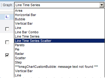
In OBIEE 10.3.4.0 Oracle gave us the date time graph. Of course we want more :-) Here is how you can make a Date Time scatter graph by editing the PCXML.

WOW: Before you start doing any editing like this BACK UP BACK UP BACK UP. Because if it goes wrong it can really F*#@$">F*#@$ your system.


Step 1: Copy the linetime.cxml file to linetimescatter.cxml. This file can ussaly be found in ..\OracleBI\web\app\res\s_oracle10\charts


Step 2: Copy the timeline.pcxml to timelinescatter.pcxml. This file can ussaly be found in ..\OracleBI\web\app\res\s_oracle10\popbin


Step 3: In the custommessages folder for the language add the following to the custommessages.xml file (create the folder and file if they don't exsist!)


Step 4: Edit the linetimescatter.cxml file
set displaynameref="kmsgChartTimeSeriesScatter"
set sawc:engineSpecific file="popbin/timelinescatter.pcxml"
Save and close the file

Step 5: Edit the timelinescatter.pcxml file

set Graph Name="graph" Type="Time" SubType="Scatter"
Save and close the file

Step 6:
restart the Java-host and the prestationserver.


Till Next Time

Tuesday, June 10, 2008

OBIEE "Private" output type for a chart

Sometimes you want the OBIEE chart in a higher graphical definition. This can be done by altering the instanceconfig.xml. Problem with this is that this will change the setting for the whole presentation server.


At one of our customers we had the need only to change this for the scatter chart and leave the rest on default (Flash)


This is how we did it:

Warning: Remember PNG and JPEG graphical types are not down drillable!

Step 1: Altering imagetypes.cxml

First locate your Chart support directory, usually found in …OracleBI\web\app\res\s_oracle10\chartsupport


Make a copy of “imagetypes.cxml” in the same directory, give it a name which refers to the chart type you want to use (eg: “imagetypesScatter.cxml” )

Open the renamed file (e.g. with Notepad):


Changed preferred to the image type you want (e.g.: “png”)


! Save the file


Step 2: Altering charttype.cxml

Now locate the charts directory usually found ….\OracleBI\web\app\res\s_oracle10\charts


Open the .CXML file for the chart type (e.g.: “scatter.cxml”)

Alter the
{?xml:namespace prefix = xi /}{xi:include parse="xml" href="fmap://chartSupport/imagetypes.cxml"}{/xi:include}{?xml:namespace prefix = xi /}{xi:include parse="xml" href="fmap://chartSupport/imagetypes.cxml"}{/xi:include}

(of course use the correct tag sign)

Till Next Time

Friday, May 23, 2008

OBIEE Changing the line color in a scatter graph with line

In OBIEE they forgot to put in a editor to change the line color for a Scatter with lines graph. It's a known issue on Metalink3. A simple workaround is to edit the PCXML file for this graph type.

You can find it in:

...\OracleBI\web\app\res\s_oracle10\popbin


Open the file scatter.pcxml

after the {/legend} tag and before {/graph} tag add the following:

{SeriesDefinition Number='1' Color='#2175BB'/} {SeriesDefinition
Number='2' Color='#F4B44D'/} {SeriesDefinition Number='3'
Color='#A4C000'/} {SeriesDefinition Number='4'
Color='#F9F400'/} {SeriesDefinition Number='5'
Color='#82AFDD'/} {SeriesDefinition Number='6'
Color='#000000'/} {SeriesDefinition Number='7'
Color='#C8C8C8'/} {SeriesDefinition Number='8'
Color='#CC6600'/} {SeriesDefinition Number='9'
Color='#CC99CC'/} {SeriesDefinition Number='10'
Color='#EE00EE'/} {SeriesDefinition
Number='11'/} {SeriesDefinition
Number='12'/} {SeriesDefinition
Number='13'/} {SeriesDefinition
Number='14'/} {SeriesDefinition
Number='15'/} {SeriesDefinition
Number='16'/} {SeriesDefinition
Number='17'/} {SeriesDefinition
Number='18'/} {SeriesDefinition
Number='19'/} {SeriesDefinition Number='20'/}

(Note replace the { and } with correct tag symbols)

Till Next Time

Tuesday, January 22, 2008

OBIEE Graphs Gradient Effect


The default graph type are rather plain a simple 'professional' effect can be created by playing around with the gradient effect in the PCXML file:

<-Chart Version='4.30.00' BorderType='None' Width='491' Height='295' BGGradientColor='#ccccff' GradientType='BottomTop' >
possible types are:
  • BottomTop
  • TopBottom
  • LeftRight
  • RightLeft

Till Next Time

Wednesday, January 16, 2008

OBIEE X,Y and data in mouse over label

One of our custumers wants not only the data value in the mouse over label but als the X and Y axis value.

You can achieve this by editing the ".PCXML" for the graph type.


%_BUBBLE_VALUE=> The value for the bubble item. [bubble]
%_CATEGORY_NAME => The name of the category that the data item belongs to. [All, except, X-Y and Time Plot]
%_CATEGORY_TOTAL => The sum of all data values in the category to which the data item belongs. [Area, Bar, Line, Pareto, Pie, Radar]
%_CLOSE_VALUE => The close value for a high-low data item. [Stock]
%_GRAPH_TOTAL => The sum of all data values in a bar, line, pie, or radar graph. [Area, Bar, Line, Pareto, Pie, Radar]
%_HIGH_VALUE => The high value for a high-low data item. [Stock]
%_LOW_VALUE => The low value for a high-low data item. [Stock]
%_OPEN_VALUE => The open value for a high-low data item. [Stock]
%_PERCENT_OF_CATEGORY => The data value represented as a percentage of the sum of all data values in its category. [Area, Bar, Line, Pareto, Pie, Radar]
%_PERCENT_OF_TOTAL => The data value represented as a percentage of the
sum of all data values in the graph. [Area, Bar, Line, Pareto, Pie, Radar]
%_SERIES_NAME => The name of the data series that the data item belongs to. [All]
%_TIME_VALUE => The time value for a Time Plot data item. [Time Plot]
%_VALUE => The value of the data item. [Area, Bar, Line, Pareto, Pie, Radar]
%_XVALUE => The x value for an X-Y data item. [X-Y]
%_YVALUE => The y value for an X-Y or Time Plot data item. [X-Y, Time Plot]


You can find the ".PCXML" files here: {OracleBI}\web\app\res\s_oracle10\popbin or {OracleBI}\web\app\res\s_Siebel77\popbin

look for
<- DataLabels Font='Size:9;Style:Bold;' TransparentBackground='False' BGColor='#FFFFFFcd' BorderColor='#EEEEEE' FormatString='%_BUBBLE_VALUE'/>
After editing you have to restart the java host and the presentation service.

Till Next Time

OBIEE Corda Popchart Example

A customer asked me to demonstrate the default "CORDA" graph types availible in OBIEE to insert into a dashboard. After a lot of ctrlC and ctrlV if made this HTML page for future reference. (You have to run it on your OBIEE / CORDA server)

graph_type_samples.zip

Till Next Time