Showing posts with label GRAPH. Show all posts

Monday, October 18, 2010

OBIEE11g Animated Graphs

One off the new features in 11g is the possibility to have animated graphs. Although you might want to use them as a selling point, I advise you to use them very very spares.

As a rule of thumb I would use only one on each dashboard, pulling the users attention to the main graph.

Till Next Time

Tuesday, March 16, 2010

OBIEE Start reading on graphs!

OBIEE 11g is coming!

We don’t no when, but we do know that the increase in graphical possibility's will be HUGE!.

In that lays a huge danger, developers have a natural tendency to try out all options, and even worse give all the options to their clients often resulting in very “colourful” dashboards.

image

If you are coming from OBIEE 10G and want to prep for 11g you might want to catch up on some reading on how to make good graphs, instead of only colourful graphs!

For several years the books of Stephen Few: (http://www.perceptualedge.com/blog/) where considered as the one and only standard. Certainly he was one of the first to write things down: (Information Dashboard Design: The Effective Visual Communication of Data ) This is still a must read for every Dashboard developer.

Recently a new book has arrived “The wall street journal guide to information graphics” by Dona M. Wong. Personally I find this easier to read then the Stephen Few book. I like the setup where on the left page there is a “bad” example and on the right side there is a “good” example. Another good feature of the book is the statistical “brush-up” chapter.

Till Next Time

Tuesday, April 7, 2009

OBIEE Using SQL based scale makers

Recently on my question page I was asked to make a step by step example on how to use SQL based scale markes in a graph.

Let's start with a simple report based on the sample sales repository:

image

image

And put it in a vertical bar graph:

image

If we want to add a scale marker goto the image axis scaling menu and press image Edit Scale markers, press add:image

Click on the edit button image

image

Now the trick is to enter an SQL statement for which the first column gives back the value you want to use for your scale marker. In this case:

SELECT MIN("F1 Revenue"."1-01 Revenue (Sum All)" ) saw_0, "D0 Time"."T02 Per Name Month" saw_1 FROM "Sample Sales" ORDER BY saw_1

Do the same for the MAX marker:

SELECT MAX("F1 Revenue"."1-01 Revenue (Sum All)" ) saw_0, "D0 Time"."T02 Per Name Month" saw_1 FROM "Sample Sales" ORDER BY saw_1

Play around with the Marker caption, color en line width:

image

And have a look at the results:

image

Till Next Time

Tuesday, October 7, 2008

OBIEE Show Thousands Separator in Chart

A customer wantend no thousand seperator by default for the y-axis in there graphs:
This is very easy when add: ShowThousandsSeparator='False' in the ValueScale tag in the PCXML file of the graph

Till Next Time

Wednesday, September 17, 2008

OBIEE Setting a picture as graph backgound

One of our customers wanted a custom background for there graphs, some what in this style :-) :

So that the would end up with a graph looking like this:Step 1: from the corda archives download version 5.1.2:http://www.corda.com/corda-update-archive.php There is a fourteen day free license key, after that you will have to buy the product.

Step 2: With the popchart builder create a new graph using the wizard, any graph will do.

Press the add image button:In the PCXML file locate the {ChartBitmap part:

Copy and paste into the PCXML file of your OBIEE graph. between the {project} tags.

Add the following reference to make the graph visible:

Playaround with zindex, if the image isn't fully on the background.

Till Next Time

Friday, September 12, 2008

OBIEE setting default Graph series colors.

If you want to set the default color for your graph, goto …\OracleBI\web\app\res\s_{StyleName}\chartsupport
Open the palette.cxml file and edit the sawc:color value=. The color is represented by a web Hex color.
Save the file.
Copy the file to …\OracleBI\oc4j_bi\j2ee\home\applications\analytics\analytics\res\s_{StyleName}\chartsupport.

If you want to make a custom setting for just one graph type, make a copy of this file and rename it to paletteGraph.cxml. in the GraphType.cxml point the xi:include href="fmap://chartSupport/palette.cxml" parse="xml" to the new file.
Till Next Time

Tuesday, September 9, 2008

OBIEE setting the bottomscale in a DTA Graph

1 Problem Description


1.1 General

With the introduction of OBIEE 10.3.4.0 the DTA (Date Time Aware) graph became available. In there haste to release this version Oracle has omitted a usable properties editor. All properties have to be set manually.


2 Properties of the DTA graph


2.1 Preface


All manual setting are done in the “timeline.pcxml” file. This file can be found in the s_{StyleName}\popbin directory. Make sure to synchronize this file with the one found in the OC4J_BI s_{StyleName}\popbin directory. After editing you have to restart the presentation server, the javahost and the webserver.


2.2 Month Names


<MonthNames>Jan,Feb,Mar,Apr,May,Jun,Jul,Aug,Sep,Oct,Nov,Dec</MonthNames>


By default the month names are presented in English. If you want for instance Dutch presentation put the following between the <Graph> tags:


<MonthNames>Jan,Feb,Mrt,Apr,Mei,Jun,Jul,Aug,Sep,Okt,Nov,Dec</MonthNames>


2.3 DayNames


<DayNames>Sun,Mon,Tue,Wed,Thu,Fri,Sat</DayNames>


By default the day names are presented in English. If you want for instance Dutch presentation put the following between the <Graph> tags:


<DayNames>Zon,Maa,Din,Woe,Don,Vrij,Zat</DayNames>


2.4 First Day Of Week


<FirstDayOfWeek>Sunday</FirstDayOfWeek>


By default the first day of the week is Sunday. If you want the week to start Monday put the following between the <Graph> tags:


<FirstDayOfWeek>Monday</FirstDayOfWeek>


2.5 Date Major Ticks

<DateMajorTicks Year=“%Y” Quarter=“Q%Q %y” Month=“%b-%y” Day=“%a” Hour=“%I%p” Minute=“%I:%M%p” />


There are 6 major ticks: Year, Quarter, Month, Day, Hour and Minute


2.6 Date Minor Ticks

<DateMinorTicks Quarter=“Q%Q” Month=“%b” Day=“%d” Hour=“%I%p” Minute=“%M” />

There are 5 minor ticks Quarter, Month, Day, Hour and Minute.

2.6.1 Cheat sheet

Type;Setting
4 digit year;%Y
2 digit year;%y
Quarter number;%Q
Month Name;%b
Month Number;%m
Month Name except replace January with 4 digit year;%F
Month Name except replace January with 2 digit year;%f
Date (1-31);%d
Day Name;%a
Hour(1-24);%H
Hour(1-12);%I
Minutes;%M
Seconds;%S
am/pm;%p

2.7 Manual Ticks Major and Manual Ticks Minor

To tell which TickMarker should be used add to the <ValueScale Position=”Bottom” tag: ManualTicksMajor=“Month” ManualTicksMinor=“Week” (!No ; between ManualTicksMajor and ManualTicksMinor!)

If you don’t want a Minor Tag make them both the same: ManualTicksMajor=“Month” ManualTicksMinor=“Month”.

2.8 Rotate labels

To rotate the labels add to the <ValueScale Position=”Bottom” tag:

RotateLabels=”30” where 30 is the angle in degrees.

Till Next Time

This article was original written for the Ciber Knowledge Blog: http://knowledge.ciber.nl/weblog/?p=130

Wednesday, September 3, 2008

OBIEE TimeLine graph Line settings

In 10.3.4.0 Oracle introduced finally the DTA or Time Line graph. In there haste to release it the forgot the chart properties editor. This means we have to edit the PCXML files ourselfs, to get dotted lines, other colors or the plus symbol.

In the timeline.pcxml file look for the SeriesDefinition tag:

Within this tag you can set the following properties:

LineColor='#ff0033'
{the color of the line; possible colors all web RGB colors}

SymbolColor='#3366ff'
{the color of the Symbol; possible colors all web RGB colors}

FillColor='#66ff99'
{the color of the FillColor; possible colors all web RGB colors}

LineWidth='1.0'
{the width of the line in pixels; possible values 'Off','1.0','2.0','3.0','4.0','5.0','6.'0'}

LineStyle='Dashed'
{the style of the line; possible values 'Plain','Dashed', 'Dotted', 'DashDot'}

SymbolType='Circle'
{the symbol at the datapoint; possible values 'Off', 'Dot', 'SmallSquare', 'Square','SquareOutline', 'Circle', 'CircleOutline', 'Triangle', 'TriangleOutline', 'Plus', 'PlusOutline', 'Diamond', 'DiamondOutline'}

ShowArea='True'
{show the area below the line; possible values 'True', 'False'}

Till next time

Wednesday, August 27, 2008

OBIEE Conditional X-axis graph

One of our customer had a unique request. If the selected period becomes longer then a predifinend period, the x-axis should switch from item 1 to item 2 without user intervention! Here is how we did it:

First create the conditonal x-axis: (Sales sample)


CASE WHEN (TIMESTAMPDIFF(SQL_TSI_DAY, MIN("D0 Time"."T00 Calendar Date"), MAX("D0 Time"."T00 Calendar Date")) > 20 ) THEN "D1 Customer"."C2 Cust Status" ELSE "D2 Market"."M02 Area" END
Next alter the Y value so that it will follow the X - axis:
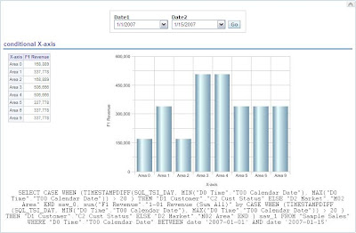
sum("F1 Revenue"."1-01 Revenue (Sum All)" by CASE WHEN
(TIMESTAMPDIFF(SQL_TSI_DAY, MIN("D0 Time"."T00 Calendar Date"), MAX("D0 Time"."T00 Calendar Date")) > 20 ) THEN "D1 Customer"."C2 Cust Status"
ELSE "D2 Market"."M02 Area" END )


Add everthing to a dashboard:

15 days:


25 days:

Till Next Time

Friday, August 8, 2008

OBIEE Date Time Scatter graph

In OBIEE 10.3.4.0 Oracle gave us the date time graph. Of course we want more :-) Here is how you can make a Date Time scatter graph by editing the PCXML.

WOW: Before you start doing any editing like this BACK UP BACK UP BACK UP. Because if it goes wrong it can really F*#@$">F*#@$ your system.


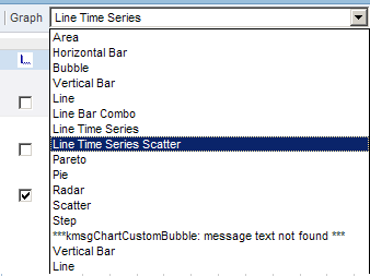
Step 1: Copy the linetime.cxml file to linetimescatter.cxml. This file can ussaly be found in ..\OracleBI\web\app\res\s_oracle10\charts


Step 2: Copy the timeline.pcxml to timelinescatter.pcxml. This file can ussaly be found in ..\OracleBI\web\app\res\s_oracle10\popbin


Step 3: In the custommessages folder for the language add the following to the custommessages.xml file (create the folder and file if they don't exsist!)


Step 4: Edit the linetimescatter.cxml file
set displaynameref="kmsgChartTimeSeriesScatter"
set sawc:engineSpecific file="popbin/timelinescatter.pcxml"
Save and close the file

Step 5: Edit the timelinescatter.pcxml file

set Graph Name="graph" Type="Time" SubType="Scatter"
Save and close the file

Step 6:
restart the Java-host and the prestationserver.


Till Next Time

OBIEE Continues Date Time Line redux

Remeber this entry: http://obiee101.blogspot.com/2008/03/obiee-continues-time-line.html ?
Well they fixed it in OBIEE 10.3.4.0. Yes OBIEE finanally has a date time aware grahtype. No more:

But real:

Thank you Oracle, this makes OBIEE live a whole lot better!

Okay the inteface is still very basic but you can influence a lot by tweaking the PCXML file for this graph.

Till Next Time

This article is also published on: http://knowledge.ciber.nl/weblog/

Monday, July 21, 2008

OBIEE number of gauges on canvas

Some time ago a colleague of mine encountered the following error screen when developing a dashboard with gauges.
After a small discussion: “why the hell he needed more then the OBIEE default of 100 gauges on a single screen?”, he convinced me that it was for development purposes only.

The properties which influence the gauge behavior can be found in the instanceconfig.xml.

If they are not yet present in the file OBIEE uses the default settings.
Till Next Time

Friday, May 23, 2008

OBIEE Changing the line color in a scatter graph with line

In OBIEE they forgot to put in a editor to change the line color for a Scatter with lines graph. It's a known issue on Metalink3. A simple workaround is to edit the PCXML file for this graph type.

You can find it in:

...\OracleBI\web\app\res\s_oracle10\popbin


Open the file scatter.pcxml

after the {/legend} tag and before {/graph} tag add the following:

{SeriesDefinition Number='1' Color='#2175BB'/} {SeriesDefinition
Number='2' Color='#F4B44D'/} {SeriesDefinition Number='3'
Color='#A4C000'/} {SeriesDefinition Number='4'
Color='#F9F400'/} {SeriesDefinition Number='5'
Color='#82AFDD'/} {SeriesDefinition Number='6'
Color='#000000'/} {SeriesDefinition Number='7'
Color='#C8C8C8'/} {SeriesDefinition Number='8'
Color='#CC6600'/} {SeriesDefinition Number='9'
Color='#CC99CC'/} {SeriesDefinition Number='10'
Color='#EE00EE'/} {SeriesDefinition
Number='11'/} {SeriesDefinition
Number='12'/} {SeriesDefinition
Number='13'/} {SeriesDefinition
Number='14'/} {SeriesDefinition
Number='15'/} {SeriesDefinition
Number='16'/} {SeriesDefinition
Number='17'/} {SeriesDefinition
Number='18'/} {SeriesDefinition
Number='19'/} {SeriesDefinition Number='20'/}

(Note replace the { and } with correct tag symbols)

Till Next Time

Sunday, March 9, 2008

OBIEE Continues Time Line

Because OBIEE graph types are not "Date/Time" aware you often face the problem of broken Date/Time Lines. If you don't want to wait for OBIEE 11G you might want to try this alternative. Our table with fuel consumption entry's doesn't have an entry for each day after filtering: Due to this fact the graphical representation is wrong:


One solution is to combine this report with a union query based on a calendar dimension:
The executed query against 10G looks now like this:


The graphical representation is no much better.


Be aware that a union query will influence the perfromance!


Till Next Time

Tuesday, January 22, 2008

OBIEE Graphs Gradient Effect


The default graph type are rather plain a simple 'professional' effect can be created by playing around with the gradient effect in the PCXML file:

<-Chart Version='4.30.00' BorderType='None' Width='491' Height='295' BGGradientColor='#ccccff' GradientType='BottomTop' >
possible types are:
  • BottomTop
  • TopBottom
  • LeftRight
  • RightLeft

Till Next Time

Thursday, January 17, 2008

OBIEE adding a customized graphtype

One of our customers had the need for some extra customized graphtypes in answers. It took me a while to figure out how OBIEE connects but here is how we did it.


  1. In the map {OracleBI}\web\app\res\s_oracle10\popbin make a copy of the PCXML for the graphtype you want customize.

  2. rename the file [FI:bubble2.pcxml]

  3. Open the file and make the custyomistions you want

  4. In the map {OracleBI}\web\app\res\s_oracle10\charts make a copy of the CXML for the graptype you want to customize.

  5. rename the file [FI:bubble2.cxml]

  6. open the file and edit in sawc:template => displayNameRef="kmsgChartCustomBubble"

  7. edit in sawc:seriesRules => displayNameRef="kmsgBubbleCustomSeries"
  8. edit in sawc:engineSpecific file="popbin/bubble2.pcxml"

  9. Save and close the file.

  10. Next we have edit the messages !you have to this for every language you use! (remember to back it up, else you loose it after every (re-)install/update of OBIEE) [EDIT: or make a custommessage folder for each language] go to {OracleBI}\web\msgdb\l_en\messages

  11. open "chartmessages.xml" and add the entry <-WebMessage name="kmsgBubbleCustomSeries"><-TEXT>Bubble - Custom

  12. Save and close the file

  13. open "charviewmessages.xml" and add the entry <-WebMessage name="kmsgChartCustomBubble"><-TEXT>Bubble - Custom

  14. Save and close the file

  15. restart the Java-host and the prestationserver.

note: replace "<-" with "<"


Till Next Time


Wednesday, January 16, 2008

OBIEE X,Y and data in mouse over label

One of our custumers wants not only the data value in the mouse over label but als the X and Y axis value.

You can achieve this by editing the ".PCXML" for the graph type.


%_BUBBLE_VALUE=> The value for the bubble item. [bubble]
%_CATEGORY_NAME => The name of the category that the data item belongs to. [All, except, X-Y and Time Plot]
%_CATEGORY_TOTAL => The sum of all data values in the category to which the data item belongs. [Area, Bar, Line, Pareto, Pie, Radar]
%_CLOSE_VALUE => The close value for a high-low data item. [Stock]
%_GRAPH_TOTAL => The sum of all data values in a bar, line, pie, or radar graph. [Area, Bar, Line, Pareto, Pie, Radar]
%_HIGH_VALUE => The high value for a high-low data item. [Stock]
%_LOW_VALUE => The low value for a high-low data item. [Stock]
%_OPEN_VALUE => The open value for a high-low data item. [Stock]
%_PERCENT_OF_CATEGORY => The data value represented as a percentage of the sum of all data values in its category. [Area, Bar, Line, Pareto, Pie, Radar]
%_PERCENT_OF_TOTAL => The data value represented as a percentage of the
sum of all data values in the graph. [Area, Bar, Line, Pareto, Pie, Radar]
%_SERIES_NAME => The name of the data series that the data item belongs to. [All]
%_TIME_VALUE => The time value for a Time Plot data item. [Time Plot]
%_VALUE => The value of the data item. [Area, Bar, Line, Pareto, Pie, Radar]
%_XVALUE => The x value for an X-Y data item. [X-Y]
%_YVALUE => The y value for an X-Y or Time Plot data item. [X-Y, Time Plot]


You can find the ".PCXML" files here: {OracleBI}\web\app\res\s_oracle10\popbin or {OracleBI}\web\app\res\s_Siebel77\popbin

look for
<- DataLabels Font='Size:9;Style:Bold;' TransparentBackground='False' BGColor='#FFFFFFcd' BorderColor='#EEEEEE' FormatString='%_BUBBLE_VALUE'/>
After editing you have to restart the java host and the presentation service.

Till Next Time

OBIEE Corda Popchart Example

A customer asked me to demonstrate the default "CORDA" graph types availible in OBIEE to insert into a dashboard. After a lot of ctrlC and ctrlV if made this HTML page for future reference. (You have to run it on your OBIEE / CORDA server)

graph_type_samples.zip

Till Next Time

OBIEE Corda Popchart

If you want to use the examples for the Corda Popchart Engine in OBIEE you first have to register a DLL .
The script is called "installCOMEmbedder.bat" can be found here:
?:\OracleBI\corda50\bin

Till Next Time

Wednesday, December 19, 2007

OBIEE Scale markers

According to the documentation you can set a scale marker based on a column value.

[quote]Options for these values include a static value, a variable, a value
sourced from a column included in the request, or one derived from a SQL
query.
Advanced options enables you to dynamically set values based on
results of a
column, query, or presentation variable which is evaluated
while rendering the
chart as follows.[/quote]
It seems that if a query is very complex (5 union all and some dashboard prompts) you loose the column selector (undocumented feature?).
==>> After futher research I discovered that this feature seems to
be turned on or off based on the availble columntypes. If you make the column an aggragate (SUM,MIN,MAX etc) you can use it directly.... <<==

You can add the scale marker manually by first adding a static marker and then editing the XML directly by replacing the linePosition part:


(saw:linePosition>(saw:columnRef columnID="c59"/> (/saw:linePosition>

( Replace the ( with < )
where "c59" is the column you want to use as a scale marker.