A Yamazumi chart is a stacked bar chart that shows the balance of cycle time workloads between a number of operators typically in an assembly line or work cell. The Yamazumi chart can be either for a single product or multi product assembly line.
Yamazumi is a Japanese word that literally means to stack up.
Toyota uses Yamazumi work balance charts to visually present the work content of a series of tasks and facilitate work balancing and the isolation and elimination of non value added work content.
1 Instructions
1.1 Minimum data
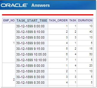
The minimum available data columns are:
- EMP_NO: identifies the employee
- TASK_START_TIME: Task Start Time
- TASK_ORDER: RCOUNT for the tasks of the employee during the period, based on the TASK_START_TIME { RCOUNT(YamazumiTable.TASK_START_TIME by YamazumiTable.EMP_NO) }
- TASK: Identifies the task
- DURATION: TASK duration in minutes
1.2 Pivot Table
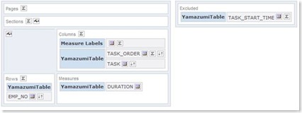
The base data has to be transformed into a pivot table:
Set the aggregation rule for duration to first:
1.3 Adding a graph
Select
Chart only, Horizontal Bar, 2D Stacked, Rectangle
Set legend to None
1.4 Colouring the Task:
Go to Format Chart Data > Conditional
Select add condition for TASK
Set the colour for each TASK
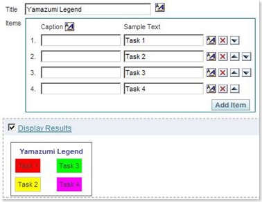
1.5 Creating a legend
Set the background colour for each task:
1.6 Organize the compound view:
Till Next Time

![clip_image002[4]](https://blogger.googleusercontent.com/img/b/R29vZ2xl/AVvXsEjYDW4R_c6mxXWZ2PNTYe57X8s6y6x5FlLT-KZrYbGXVZ7bivpRIkEqDpJ66LPMsqZ9wgEgUWq6oqorZdeHPtvqiHsCoQsSm4GTlClIZb6I_mK5v0kWl7_W4b-A-NgZ5hanJstSgY8ZNXFH/?imgmax=800)


2 comments:
Hmm.. where have I seen this before.. ;)
Post a Comment