Mark did a nice one for the oracle magazine:
http://www.oraclemagazine-digital.com/oraclemagazine/20110506?sub_id=XlEEkfqlGJ7M&folio=49#pg52
Till Next Time
Mark did a nice one for the oracle magazine:
http://www.oraclemagazine-digital.com/oraclemagazine/20110506?sub_id=XlEEkfqlGJ7M&folio=49#pg52
Till Next Time
When you want to do a conditional format on a chart in OBIEE by default you only have two choices:

Based on a value or based on a presentation variable.
But what if you want to do it based on an other column. Let’s say you want the bar to be completely red if it’s below the line and completely green if it’s above the line:
First add two ‘dummy’ conditions one for red and one for green:


Next goto the advanced tab and located the conditions in the XML:

<saw:conditionFormats>
<saw:conditionRule>
<sawx:expr xsi:type="sawx:comparison" op="less">
<saw:columnRef columnID="c1"/>
<sawx:expr xsi:type="xsd:decimal">0</sawx:expr></sawx:expr>
<saw:visualFormats>
<saw:visualFormat className="barProp" name="normalBar" color="#FF0000"/></saw:visualFormats></saw:conditionRule>
<saw:conditionRule>
<sawx:expr xsi:type="sawx:comparison" op="greaterOrEqual">
<saw:columnRef columnID="c1"/>
<sawx:expr xsi:type="xsd:decimal">0</sawx:expr></sawx:expr>
<saw:visualFormats>
<saw:visualFormat className="barProp" name="normalBar" color="#00FF00"/></saw:visualFormats></saw:conditionRule>
Chance <sawx:expr xsi:type="xsd:decimal">0</sawx:expr> to the column you want use like: <sawx:expr xsi:type="sawx:sqlExpression">"11 Time Series"."1-07 Revenue (Qago)"</sawx:expr>
Don’t forget to press the set XML button:


hmmmm this is not what we want!
What went wrong? The expression builder for the chart conditional format accepted our tweak:

The problem is the way the Presentation-server tells the Corda Engine to create the graph. Since the Corda engine can’t ‘see’ the data it needs to get it’s conditions HardCoded. This means the Presentation server will evaluate the first value of the SQL expression and sent it to the Corda engine.
Is there a workaround? It’s actually quit simple. Add two more columns to your table RED and GREEN:


Add them to your chart and make it a stacked bar:

Remove the legend:

Add it to your compound layout and add a extra legend:


Till Next Time
Google has added some amazing new charts to there portfolio. check out http://code.google.com/apis/visualization/documentation/gallery.html

Add them with a narrative view as I showed you before.
Till next time
Ever seen these:

They are QR Codes: http://en.wikipedia.org/wiki/QR_Code. Most modern mobiles have a small application on board which can read the information. Because of the build in error correction they are ideal for stuff like address labels.
With google chart you can easily integrated them in an OBIEE report. Say you want to code http://obiee101.blogspot.com/
add the formula:
'http://chart.apis.google.com/chart?chs=150x150&cht=qr&chl=http://obiee101.blogspot.com/&choe=UTF-8'
Set the column type to image URL:

More info: http://code.google.com/intl/nl/apis/chart/types.html#qrcodes
Till Next Time
This article is also published on http://knowledge.ciber.nl
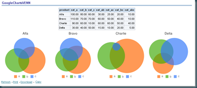
Impress with real venn diagrams:

First get your data:

add an extra column with a row count:


Hide it:

add an narrative view:
<img src="" id="venn_chart@9"/> <!-- creates an unique img tag -->
<script type="text/javascript">
var chartURL = "http://chart.apis.google.com/chart?cht=v&chs=200x200&chd=t:@2,@3,@4,@5,@6,@7,@8&chtt=@1&chdl=a|b|c&chdlp=b" ;
/* cht = chart type
chs = chart size
chd = chart data
chtt = chart title
chdl = chart legend
chdlp= chart legend position
more info http://code.google.com/intl/nl/apis/chart/ *//* get the chart */
document.getElementById('venn_chart@9').src = chartURL;
</script>
Put all together:
Till Next Time
This article is also published on http://knowledge.ciber.nl
or how to get from:

to this:

in 5 minutes.
It uses the same technique we used with the googlemaps. Create a new narrative view.
In the prefix part put:
<!--Get an empty map-->
<img src="http://chart.apis.google.com/chart?cht=t&chm=europe&chs=440x220" id="GD_mapImg"/>
<!--chm ==> geographical area (africa, asia, europe, middle_east, south_america, usa, world)-->
<!--chs ==> canvas size max 440X220-->
<!--more info http://code.google.com/intl/nl/apis/chart/ --><script type="text/javascript">
// setting up parameters
var chartURL = "http://chart.apis.google.com/chart?cht=t&chtm=europe&chs=440x220&chds=1,6";
var chartBGColor = "&chf=bg,s,EAEAEA";//specify the gradient: <default color>, <start of gradient>,.., <end of gradient>
var chartPalette = "&chco=AEF5EB,EFE6CE,DFAE6B,1F6913,D94801,A63603,7F2704";var chartDataLabels = new Array();
var chartData = new Array();
In the Narrative part put:
// Use the push command to fill the array:
chartDataLabels.push('@1');
chartData.push(@3);
In the postfix part put:
// putting it all together
chartURL = chartURL + chartBGColor + chartPalette + "&chld=" + chartDataLabels.toString().replace(/,/g,'') + "&chd=t:" + chartData.toString();;
// now get the image from Google Chart
document.getElementById('GD_mapImg').src = chartURL;
</script>
Remember to check the HTML box:

There are maps for africa, asia, europe, middle_east, south_america, usa and the world. For more info see: http://code.google.com/intl/nl/apis/chart/
Till Next Time
This article is also published on http://knowledge.ciber.nl
First of all from a visual design stand point they are horible! Why? You are comparing 5 sources of data on a 2D surface. Most people already have problems interpreting a 3D graph. Anyway let's give it a try:
Let's start with a basic report:


It gives two dimensions (Brand & Market), two measures (Revenue and Revenue Yago), there comparision (Revenue Yago / Revenu)
The OBIEE buble chat has 5 elements:


This would give us:

Resulting in this chart:

On a personal note I find this a horrible chart....
If your really need this much info at once try splitting it into two graphs:


Till Next Time
Recently I was asked how to get opaque (see trough) data labels on a chart:

This is control by the pcxml file belonging to the Graph type:
Open the file in an editor and look for the "DataLabels" tag. Edit the last to numbers (hex) of the BGColor subtag to "00"

(sync the file with the one in the OC4J if used). Restart everything.
Till Next Time
As promised in a previous article (http://obiee101.blogspot.com/2009/04/obiee-final-skills-creating-great.html) I will show you some tips and tricks on how the implement the findings of Stephen Few in OBIEE.
Let's start with a simple top 7 list of product revenue:

If we go to the the default chart we get:

Step 1 is to convert this to a horizontal barchart:

Step 2 convert to 2d rectangle effect:

Step 3: Remove the grid lines:

Step 4: Add a title and data labels:

Step 5: Set the axis title and labels:

Step 6: Remove the "chart box" by setting the Major Gridline colour the same as the background.

Step 7: Set the bar colour:

Let's compare both:

Still you have to consider if a simple list:

Till Next Time


