As promised in a previous article (http://obiee101.blogspot.com/2009/04/obiee-final-skills-creating-great.html) I will show you some tips and tricks on how the implement the findings of Stephen Few in OBIEE.
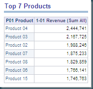
Let's start with a simple top 7 list of product revenue:
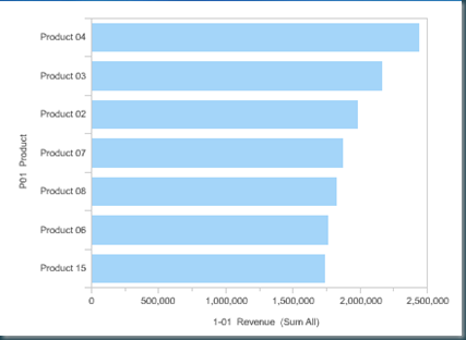
If we go to the the default chart we get:
Step 1 is to convert this to a horizontal barchart:
Step 2 convert to 2d rectangle effect:
Step 3: Remove the grid lines:
Step 4: Add a title and data labels:
Step 5: Set the axis title and labels:
Step 6: Remove the "chart box" by setting the Major Gridline colour the same as the background.
Step 7: Set the bar colour:
Let's compare both:
Still you have to consider if a simple list:

Till Next Time


No comments:
Post a Comment